Goal
We narrow the page to one action and remove anything that weakens the path to contact.
Landing pages
For campaigns, offers, services or launches that need a shorter path from attention to contact.
In short: A landing page is a single page focused on one action — a signup, an inquiry or a purchase. It guides from problem through offer and proof to contact, without the distraction of a full brand website. It works best for a campaign, a launch or a single service.
Example / use case
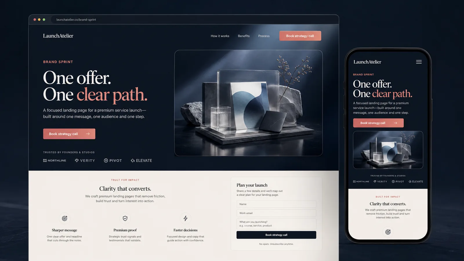
A focused offer page should explain one service or campaign in a tight sequence: problem, offer, proof, FAQ and contact. The visual direction stays clear and premium, but the page is built to shorten the path to inquiry.
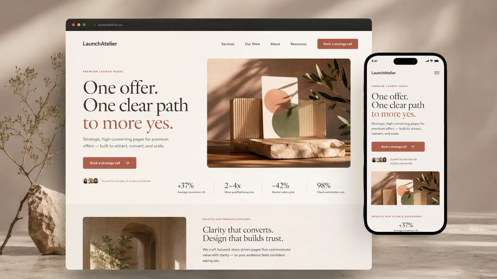
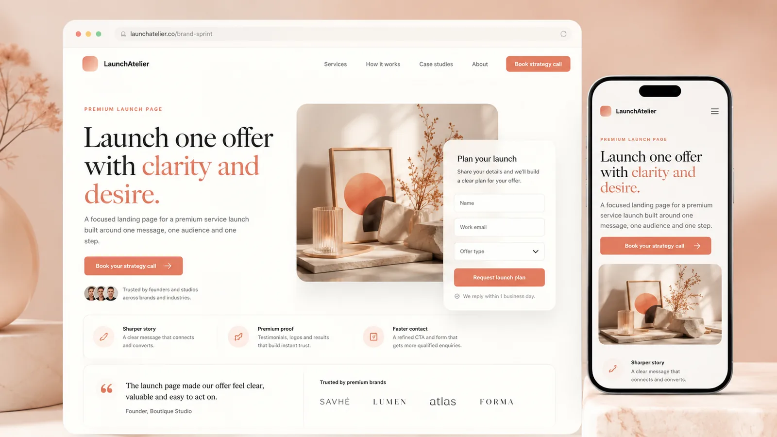
Conversion flow
We narrow the page to one action and remove anything that weakens the path to contact.
I arrange the hero, benefits, proof, objections and CTA in a clear order.
The page is built as a focused responsive funnel, not a heavy multi-page site.
We test the message, mobile rhythm, form/contact path and final details.
Information
When one offer, campaign or service needs a short path to contact without the weight of a full site.
Yes, if it supports the goal. Sometimes a simple email or contact CTA is enough and less fragile.
I can refine the structure and wording, but the offer details should come from real business context.
Send a short description of the project, current materials and the result you want to reach.
Write about your project